Load–velocity profile vs force–velocity curve — why the practical and theoretical curves don't align
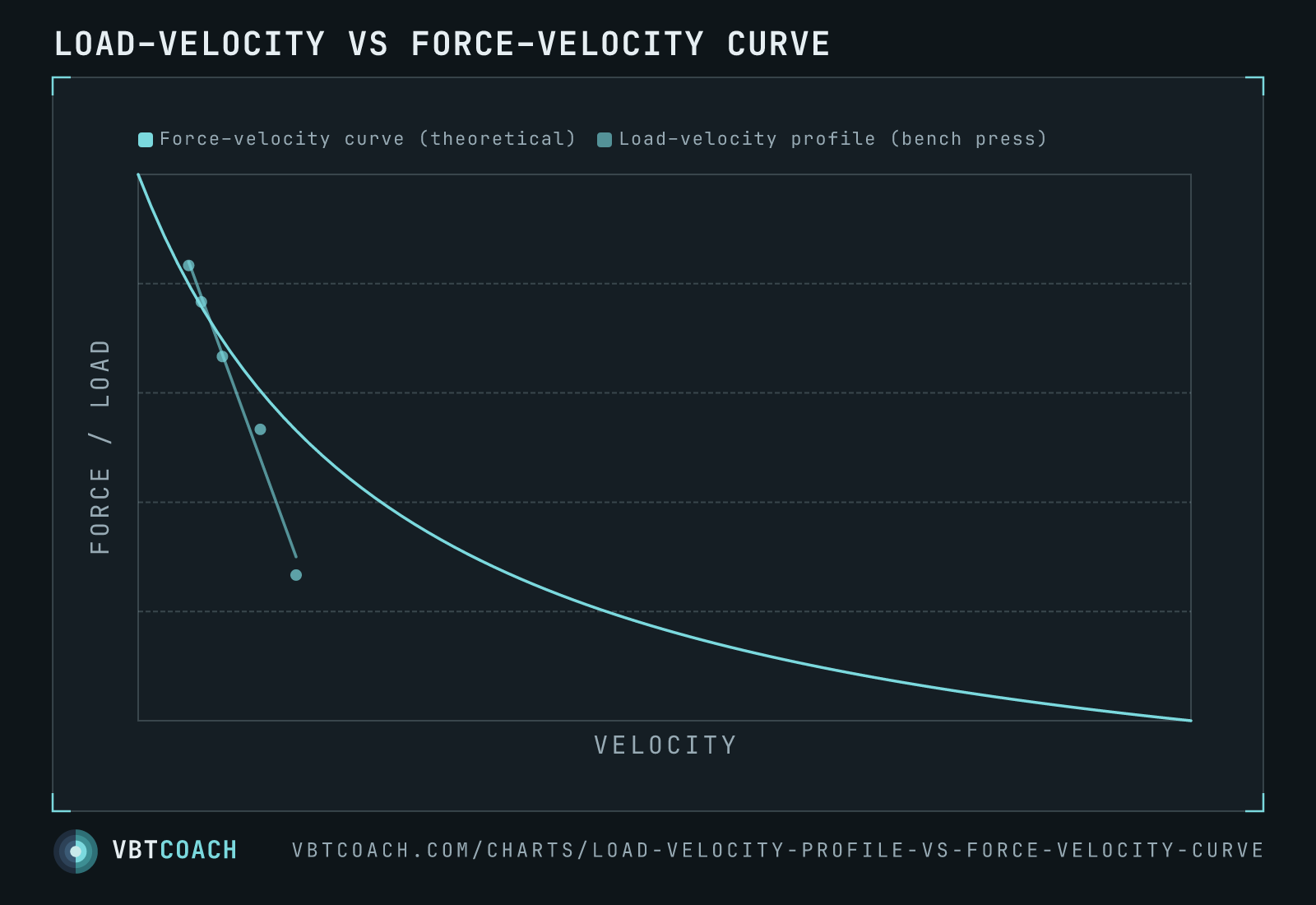
The load–velocity profile is the practical, lift-specific line you measure in the gym. The force–velocity curve is the theoretical Hill hyperbola from in-vitro muscle physiology. Plotted on the same axes, they don't match — and that mismatch is the point.
The force–velocity curve, first described by Archibald Hill in 1938 using in-vitro frog muscle, is the textbook physiology line: as shortening velocity rises, the force the muscle can produce falls along a smooth hyperbola. The load–velocity profile is the practical chart we draw from working sets in the gym — it relates the load on the bar to the velocity the lifter produces, and it comes out essentially linear for any given exercise.
Plotted on the same Force / Velocity axes, they don’t agree.
How to read this chart
Same axes for both series:
- Teal curve: the theoretical FV curve, smoothly hyperbolic. Force is at maximum when velocity is zero (isometric) and falls toward zero as velocity approaches maximum shortening velocity.
- Slate line + dots: an actual load–velocity profile from a bench-press session. Five points connected by a near-straight line, because measured LV profiles really are that linear across normal training loads.
The two intersect once. Either side of that intersection they diverge sharply.
Why this matters
The five-zone velocity model is often illustrated as evenly spaced zones along the FV curve, with the suggestion that you can train each zone by lifting at the right speed. That picture quietly assumes the LV profile (what you actually feel and measure on the bar) matches the FV curve (what muscle does in a test tube). It doesn’t.
- The FV curve is theoretical and aphysiological. It describes a single isolated muscle, not a multi-joint lift. Limb lengths, joint angles, coordination, intent — none of that lives in Hill’s equation.
- The LV profile is empirical and lift-specific. Build a profile for the squat and one for the bench press and they look completely different in slope and intercept. Build a profile for the same lift on two athletes and they differ again. There isn’t one profile to map zones onto.
- The zones are stuck to neither. If you prescribe by a fixed velocity number, you can’t say it lives “in the speed-strength portion of the curve” because the curve isn’t where the lift is. The number sits somewhere on the lifter’s LV profile, which doesn’t follow the curve’s shape.
When to cite this chart
- Debunking universal velocity zones. Show the chart, point at the two divergent lines, ask which one the zones are supposed to live on.
- Teaching coaches the difference. Coaches new to VBT often conflate the two. The chart makes the distinction visible in one image.
- Building the case for individualised profiling. Once it’s clear the LV profile is the practical chart and it differs by lift and by athlete, individualised profiling is the obvious next step.
Download high res chart images
High-resolution PNG, 1600×1000, watermarked. Free to share, embed in slides, or print. Credit appreciated.