Acceleration-time graph — why rate of change is so spiky
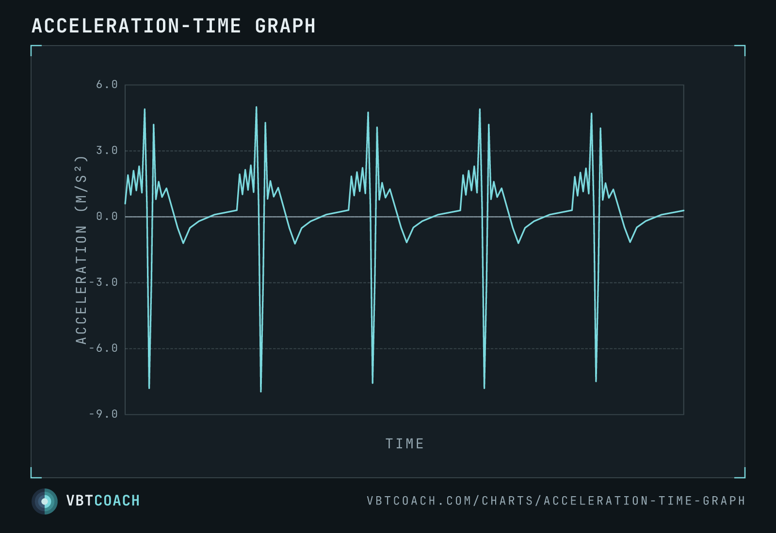
The acceleration of the bar across the same five-rep set. Because acceleration is a rate of change, it spikes hard at every turnaround — the reason peak-based metrics are so sensitive to noise.
Acceleration is the rate of change of velocity — so this graph is the derivative of the velocity-time graph, across the same five-rep set. It looks far more violent, and that spikiness is exactly the point.
How to read this chart
The y-axis is acceleration in m/s². Where velocity is changing fast — every turnaround at the top and bottom of a rep — acceleration spikes hard: a tall positive spike as the lifter drives, a deep negative spike as the bar decelerates into the turnaround. Through the smoother working phase of each rep, acceleration is a noisy staircase near the middle of the range. The x-axis is time, no numeric ticks.
Why this matters for choosing a metric
The reason to care: peak velocity is calculated from a tiny slice of this signal — often a single 1/100th-of-a-second sample near the top of the concentric. Because the underlying acceleration is this jagged, a small bar vibration, a flick, or a shift in sensor placement can land right on that sample and throw the peak reading off. That’s the reliability problem with peak velocity and peak power.
Averaged metrics — mean and propulsive velocity — pull from 50+ samples across the rep, so the noise you see here cancels out. That’s why they’re harder to cheat and more reliable session to session, even if any single instant is less “valid”.
Where to go next
The smoother signal this is derived from is the velocity-time graph. To see where peak, mean and propulsive are each measured on one rep, see the anatomy of a rep. The reliability-vs-validity argument is laid out in full in Is everything we know about VBT wrong?.
Download high res chart images
High-resolution PNG, 1600×1000, watermarked. Free to share, embed in slides, or print. Credit appreciated.