Anatomy of a rep — peak, mean and propulsive velocity on one trace
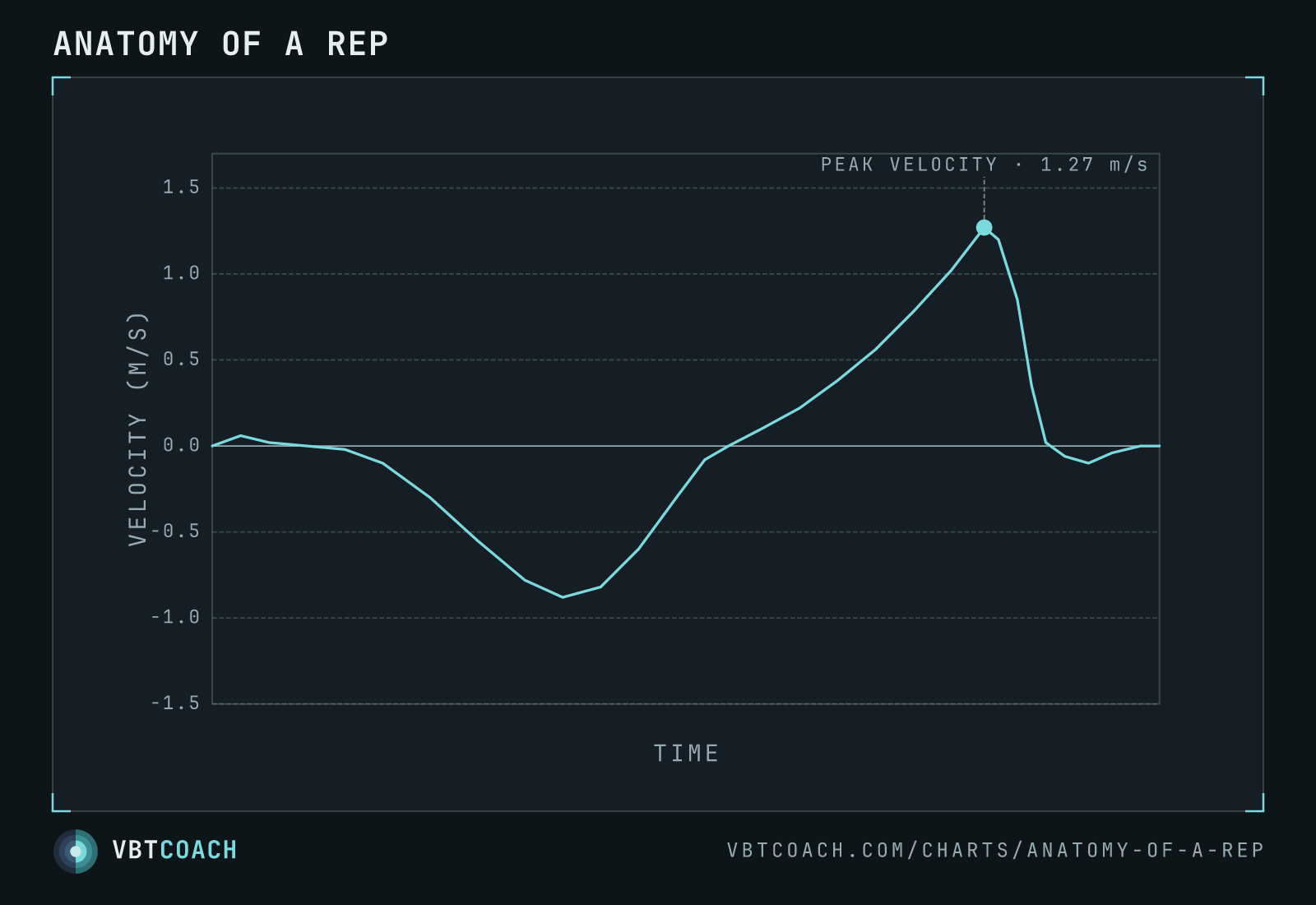
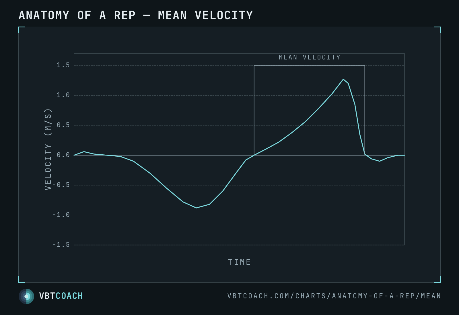
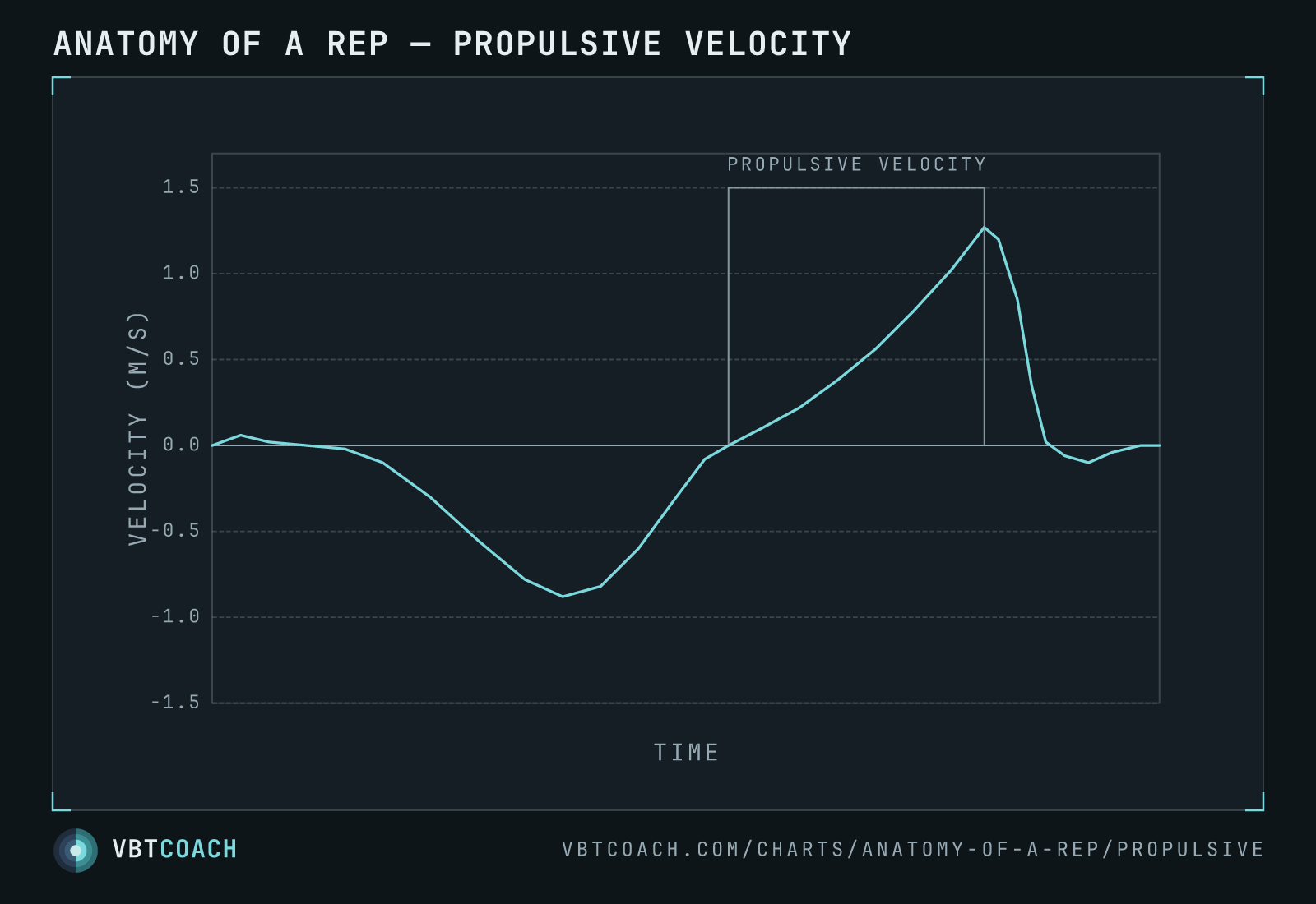
The velocity-time trace of a single rep, with the three ways to measure it drawn on: peak velocity (the fastest instant), mean velocity (average of the whole concentric), and propulsive velocity (concentric up to the point of deceleration).
One rep has one velocity-time trace — the bar dips down through the eccentric, turns around at the bottom, and accelerates up through the concentric to a peak before it stops at the top. But there are three different numbers you can pull out of that single curve, and they don’t agree. This chart draws all three on the same rep so you can see exactly where each one is measured.
How to read this chart
The y-axis is velocity in m/s; zero is the top or bottom of the rep (the bar isn’t moving). Below zero is the eccentric lowering, above zero is the concentric drive. The marker at the top of the concentric is peak velocity — the single fastest instant, here about 1.27 m/s.
- Peak velocity — the highest point on the curve. One instant, a handful of samples.
- Mean velocity — the average across the whole concentric window (bracket): from the bottom turnaround to the moment the bar stops at the top, deceleration phase included.
- Propulsive velocity — the average of only the driving portion: from the bottom turnaround up to the peak, cutting off the instant active deceleration begins.
Eccentric vs concentric — the two phases of the rep
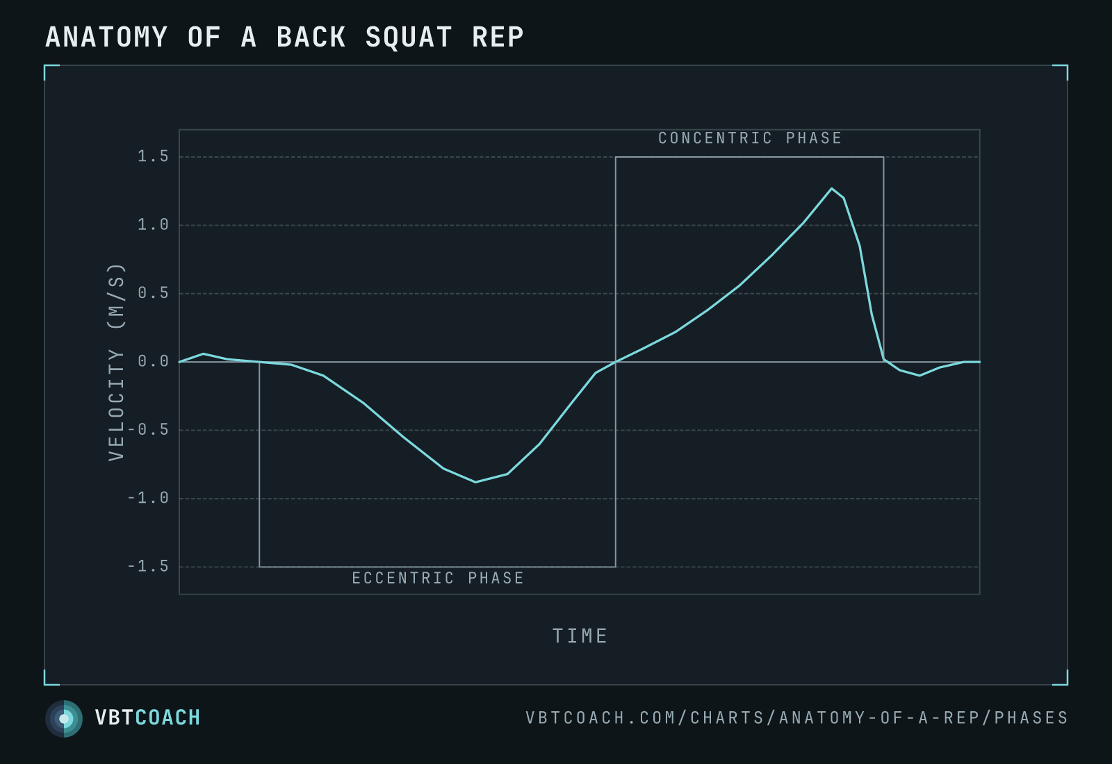
Step back from the metrics and the same trace shows the two halves of a back squat rep. Everything below zero is the eccentric phase — the bar being lowered — and everything above zero is the concentric phase, the drive back up. That concentric window is exactly the span mean velocity averages over.
Most velocity metrics only report on the concentric (positive) half; the eccentric half is where tempo, control, and a good chunk of the training stimulus live, but it’s rarely measured. Seeing both on one trace is a reminder that the number on your device describes roughly half of what actually happened in the rep.
Why the three disagree
On heavy loads (above ~75 % 1RM) there’s almost no deceleration phase — the bar slows because it’s heavy, not because you brake it — so mean and propulsive velocity are nearly identical. On lighter loads a lifter moving with intent has to actively brake the bar at the top to avoid throwing it. That braking phase drags the mean down but is excluded from propulsive, so the two diverge. Peak velocity ignores the whole averaging question and just reports the fastest instant — which makes it the most sensitive to noise (a bump, a flick, a sensor wobble).
When to use each
- Peak — explosive lifts with a float phase (Olympic lifts, jumps, throws) where the fastest instant just before release is what matters.
- Mean — heavy strength work where the concentric has no meaningful deceleration.
- Propulsive — lighter strength work where you want intent without being punished for braking the bar.
Where to go next
See the full argument — including why one universal “working-phase” metric might replace all three — in Is everything we know about VBT wrong?. The same rep, viewed across a whole set, is the velocity-time graph; its rate of change is the acceleration-time graph.
Download high res chart images
Every chart on this page as a high-resolution PNG — 4 exports, 1600×1000, watermarked. Free to share, embed in slides, or print. Credit appreciated.