Velocity-time graph — what a full set looks like rep by rep
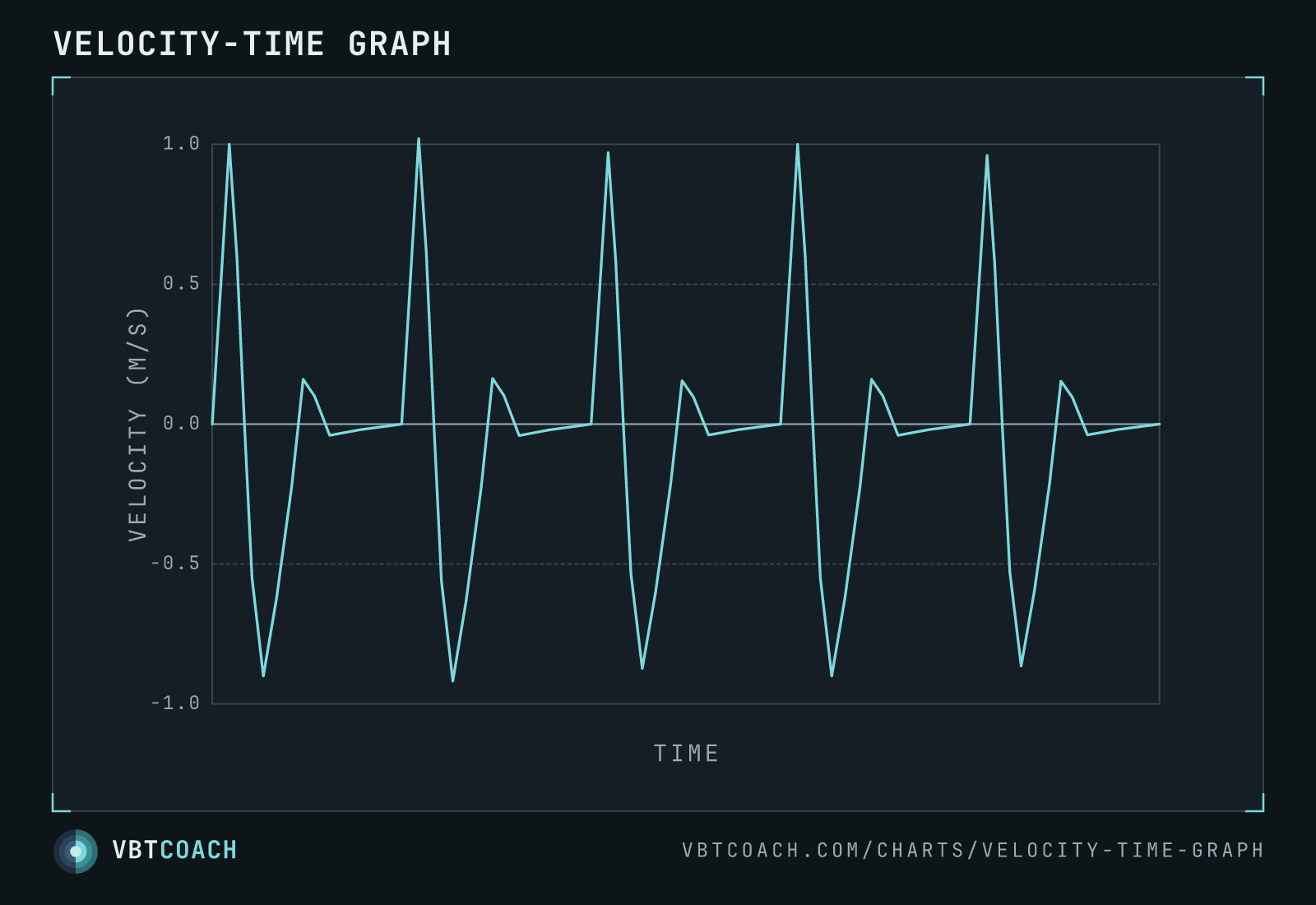
Bar velocity across a whole set of five reps. Each rep is a concentric spike above zero and an eccentric dip below it — the raw signal every velocity metric is calculated from.
This is the raw signal underneath every velocity metric: bar velocity plotted against time across a full set of five reps. Before software reduces a rep to a single number — mean, peak, propulsive — this is what it actually measured.
How to read this chart
The y-axis is velocity in m/s. Zero is the moment the bar isn’t moving — the top or bottom of a rep. Each rep is one cycle: a concentric spike above the line (the bar driving up, peaking near 1 m/s here) followed by an eccentric dip below the line (the bar being lowered for the next rep). The x-axis is time; there are no numeric ticks because the shape of the set, not the exact duration, is the point.
Five reps, five cycles. The peaks aren’t perfectly identical — small rep-to-rep variation is normal, and a fatiguing set would show the concentric peaks trending down.
What to notice
- The zero crossings mark the turnaround points — top and bottom of each rep.
- Above the line is concentric, below is eccentric. Most VBT metrics only use the concentric (positive) portion.
- The concentric peak is where peak velocity is read; the area under the concentric is what mean and propulsive velocity average.
Where to go next
Zoom into a single rep to see exactly where each metric is measured on the anatomy of a rep. The rate of change of this same signal — which spikes hard at every turnaround — is the acceleration-time graph. The full discussion is in Is everything we know about VBT wrong?.
Download high res chart images
High-resolution PNG, 1600×1000, watermarked. Free to share, embed in slides, or print. Credit appreciated.